
Movies run at 24 frames. Books run at however much Ritalin you can afford.
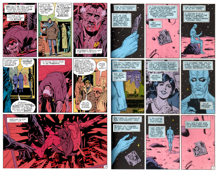
Alan Moore argued that a key reason that Watchmen should never (and could never, he may still have won that one) be adapted into a film was the detail he deliberately lent to every single panel, “the books themselves were written to show off what the comics medium can do that the films can’t”. Watchmen, in its hundreds of pages is dominated by a 3×3, 9 panel a page structure – a deliberate slow burn rhythm that lent each panel the same platform for the reader’s attention. Gibbons and Moore basically created a narrative exhibition, each page was a series of moments for you to sink in and take at your own leisure; by merit of their storytelling capacity, you’d immediately get the core narrative information from each panel but since they were all equal in effort and space – no creator tried to guide you to focus on anything. If you wanted to stare at a panel with Dr Manhattan realising even he can’t drunk dial an ex through an old photo longer than Ozymandia’s “non-traditional” physics lessons to The Comedian, you would – no one would guide you otherwise.
For reference, here’s the clip of The Comedian’s goodbye party on YouTube:
(Goddamn. Someone has to make an on rail shooting game where you fight your way through the Tate. That’d be fucking awesome. The monsters would be so goddamned varied. House of The Dead, as a title, would be some on the nose satire on Conservative art funding policies.)
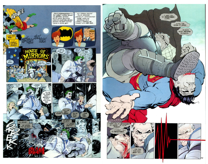
With Miller, it isn’t even just the panel structures and sizes that give away just how he treats speed. With some panels, there’s immaculate, thick detailed line work. It’s eye catching. The Superman fight, works so wonderfully well not simply as some fantasy fulfilment, but as an exercise in near relentless momentum and speed.
With a panel Miller is using solely to get some quick info out, there are a few lines, a glaze of colours by Varley and no more. Miller is saying “don’t spend time here. It’s a thing. The narrative has moved forward by the amount of info it has offered. Here focus on this next thing“. His famed TV boxes are consistently small, a fractious shard of the page, a handful of pen scratches and a few words before another the next one comes in, ensuring a rapid fire debate that rarely allows the narrative to do anything other than sprint. Miller’s museum is a guided tour; (imagine Frank Miller as a tour guide) it doesn’t move at 24 frames a second but at 1000 frames as well. Then 2 frames. Then 60 frames. Different moments are worth only so much of your attention, spend 2 hours gazing into Van Gogh and 2 minutes ignoring a 335th“Damien Neo Liberal Capitalist hedonist Hirst” rant.
Comics are unique in how they pass out information, there is no uniform speed wired into the medium, even with the potential constraint of text comprehension speed, a tiny panel with four sharp words will likely take far less time and focus than a half page with a paragraph of exposition. Contrast that to a book, by virtue of a person’s reading speed, there’s an inbuilt consistency that is very difficult to transcend. There are ways around, sparse language, life stories delivered in a paragraph, thrilling sequences that spike reader speed on the virtue of Café Nero delivered adrenaline, sure. Hemingway proved a minor capacity to manipulate speed in A Farewell to arms:
The way that passage reads, once we leave the standard sentences behind, it builds momentum, we read it breathlessly, as if we were saying an entire paragraph without pause. There is some capacity to control speed, but its more momentum driven than it is a way to guide attention.
Speed isn’t simply defined by panel or word counts here either. Take Tamara Drew, there’s a broadly languid pace. Slow enough to afford you time to breathe in the atmosphere and let the characters air out enough so that they’re people in lieu of plot devices. Posy Simmonds achieves this, less by reference to the weight she lends her panels, in size or detail, and more through the interaction of text and graphic. The colour range too, is a remarkably restrained one. Unlike Watchmen or TDKR, it doesn’t go for brazen colours that try to set the page alight for your attention; it simply rests with the text, more interested in setting a tone than propelling the narrative.
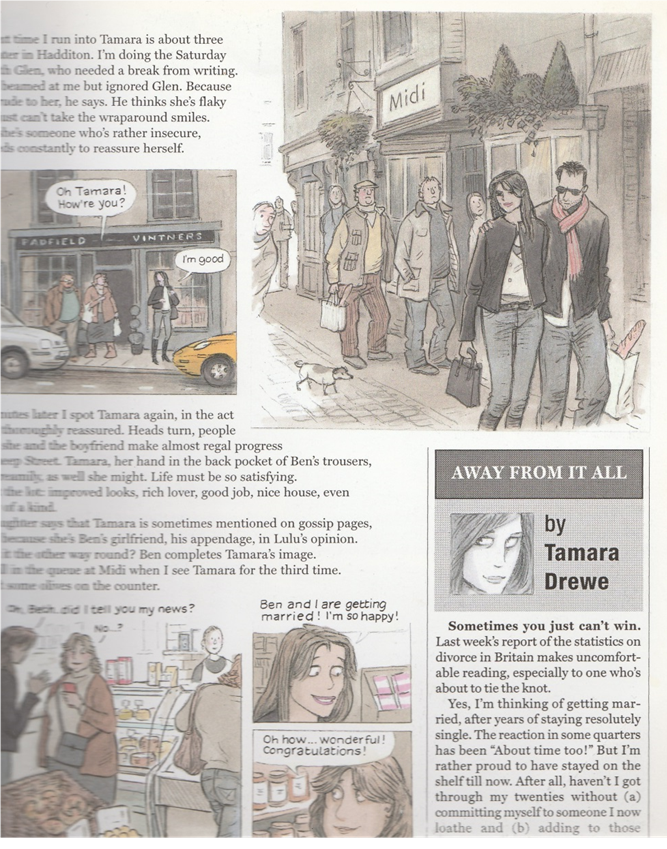
We’re too used to a yellow box inside a picture frame, 10-20 words, a scrap of a description, a witty one liner – a narrative diet of old crumbs dipped in hot sauce. Instead of forcing text and graphic to live with each other in cramped surroundings, like some arsey “The Odd Couple” reference, Simmonds often just cooks up a series of beautifully telling images and lets a big block of words simmer next to them. The effect is soothing, unlike Moore who imposes a very consistent rhythm and Miller who seems to view speed as a binary choice between the settings “Cocaine” or “Pablo Escobar”, we’re invited to just let it soak in. Enjoy the image, read the words, let the effect of both coalesce at your leisure. Considering the story, tone and setting of Tamara Drewe, it’s a fairly sharp move. Somehow the funny character nuances sparking off in that South East rural England writers retreat wouldn’t quite land as well with 20 nano panels and staccato sentences than it would with the large, detailed panels and clearly placed text blocs that they sit with. No, I haven’t bothered watching the movie. Unless..does she get nake—-Wait is this public? Is someone actually reading this?! HELLO, I’M BEING HELD AGAINST MY WILL BY THE LONDON GRAPHIC NOVEL NETWORK. THEY KEEP MAKING ME READ 2000AD AND TELLING ME THAT FABLES SUCKS. SOMEONE PLEASE—*muffles the end of cheap joke*
Okay so Tamara Drewe does actually do some “Odd Coupling”, but it does as many pages like the above and it run at a slower clip than your standard comic book fare. Though the “typical” thing I’m talking about tends to be superhero riven, so generally there is kicking and screaming and helicopters exploding into bathtubs and are naturally more exciting than people talking in a supermarket.
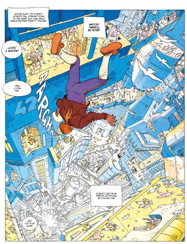
Instantly, an image lets you know exactly what’s going on. It takes longer to read one of those text boxes than it does to understand what’s happening. You don’t know why he’s falling or who he is, but you know that he is, that he’s in a futuristic sci-fi metropolis and he didn’t plan to be falling down. So regardless of how you set things out for a reader, the text you utilise is still going to be a fairly major control on speed – since yeah, a picture is actually worth a thousand words (though a lot of those words are monosyllabic and out of *Insert that politician you don’t like here*’s manifesto).
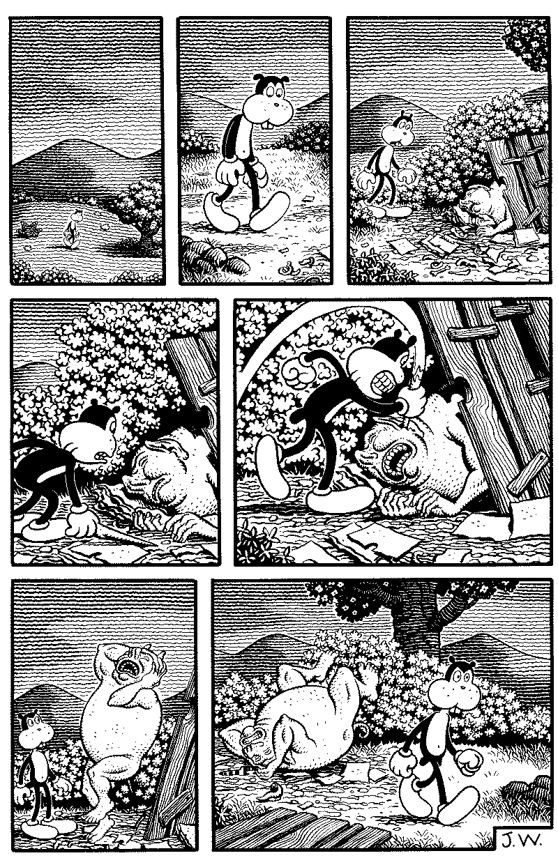
Okay then, what about something that communicates entirely visually – so speed becomes a matter entirely determined by panel design and weight lent to images? Okay, here comes a different Frank. Frank by Woodring. Don’t worry, this Frank is nuts and brilliant and impossible and terrifying – just in a different way.
Look ma no words (kill me.) Here, Woodring guides the time spent with a panel not by detail but by panel size allocated to the dramatic weight of the information conveyed.
Okay. Caffeine is winding down. I think I’ve got a sense of this.
In comics and graphic novels, speed can be controlled, usually on a page by page basis (though good story telling can change gears in the span of a single page. There are 3 primary elements that an author(s) can use to achieve this: Panel space, text quantity and image detail. There is of course, no broad rule over which has primacy over which, in each example offered, there are obvious digressions from what I’ve been looking towards. What I wanted to get across is the idea that as a medium, comics are unique in their capacity to guide and control reader attention, and focus to specific pieces of narrative information, at an incredibly specific, panel by panel level. Sure, text and reading comprehension is a bit of a break on that, but as TD shows, a writer invites that break by merit of the amount of weight they lend an image and the quantity of text they bind it to.
But yes, comics can control speed like nothing else.
